Due to a Non-Disclosure Agreement some details on this project are limited.
A state government's job board has been running since the mid 1990s. In recent years, the platform's use has significantly decreased despite the fact that it is free and there is a genuine interest from employers to use the site.
The state government wanted to re-imagine and modernize the job posting experience while still keeping their old database structure intact. How do we modernize a job posting platform while still using its old bones and meet user needs for state government employees, employers, and potential hires?


We first engaged with the client by facilitating several process mapping sessions. The client side consisted of the core group of stakeholders which included:
During these sessions, we established the following:
Together with out stakeholders, the team mapped out general pain points that broadly affected all types of employers trying to use the site. Within this exercise, we identified three themes as the source of these pain points:

After plotting out all of the pain points that users are generally experiencing, we took a look to see if some pain points could be clustered into certain groups. From this exercise, we were able to see two personas emerge.

Businesses that employ thousands of people through several locations statewide.

Consists of business that are run by individuals, so called “mom and pop” shops.
After diagnosing pain points, we asked the stakeholders to share their hopes, expectations, and measures of success for a revamped version of the employer part of the site.

Each bucket of ideas was then filtered down to what was feasible within the timeline and brought the most value. Broadly speaking, we realized our ‘visions’ and ‘goals’ could be separated into the three large pieces of the site:

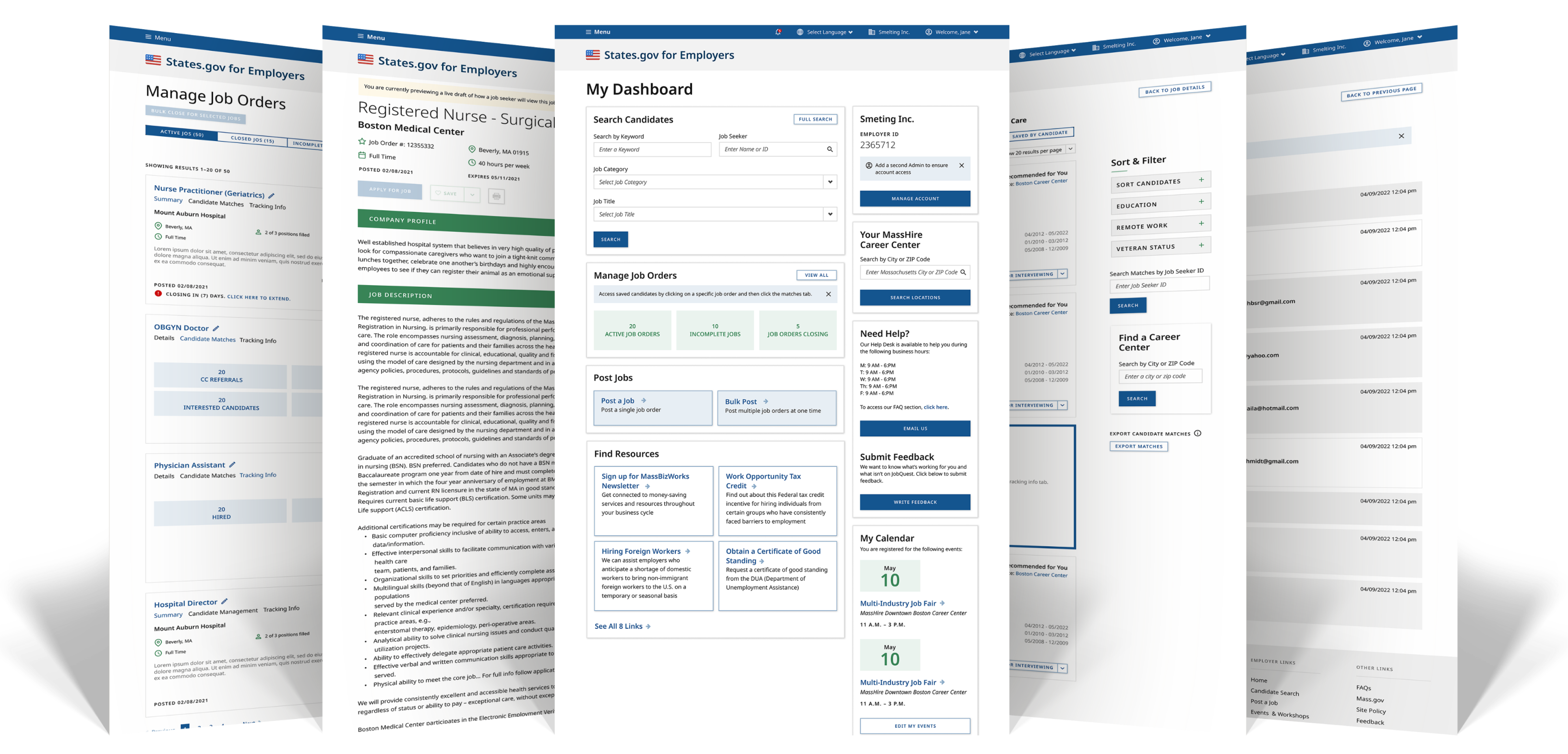
dashboard
notifications
emails

receive career center candidate recommendations
track candidates throughout interview process
dashboard
notifications
emails
receive career center candidate recommendations
track candidates throughout interview process
dashboard
notifications
emails
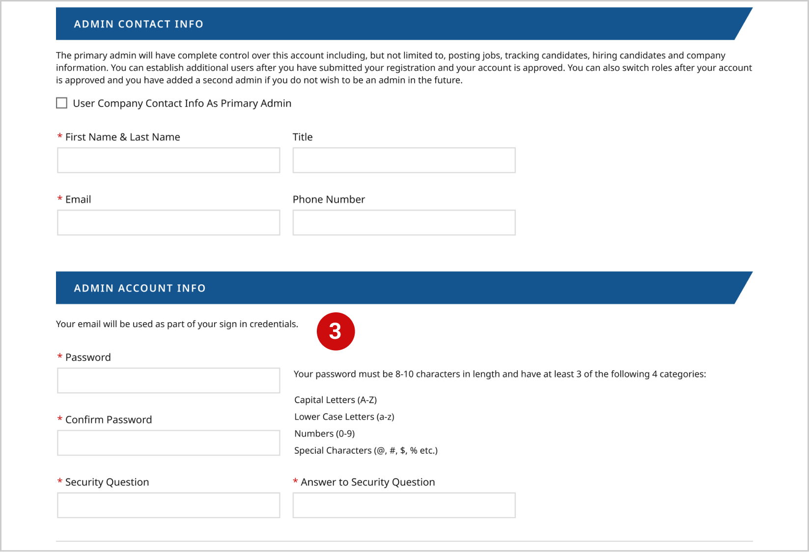
Registration is actually four steps long but the lack of a step counter implies there is only one causing user fatigue.
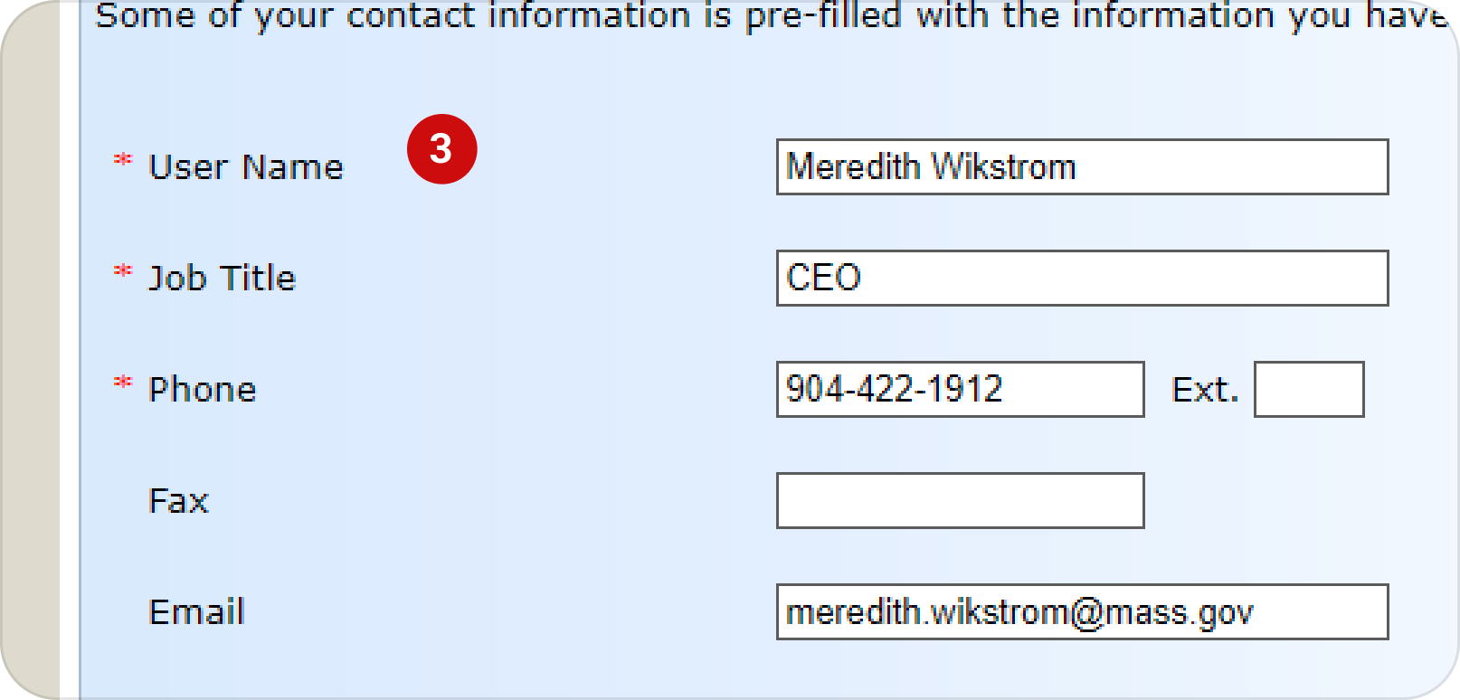
While every state business possesses a FEIN (Federal employer identification number), it’s not a commonly requested credential. Many business owners would not have the information memorized. There’s also no information within this form telling a business owner how to locate their FEIN.
The original infrastructure only allows one set of password credentials per company regardless of size. This leads to problems where multiple individuals representing one company were unable to access the account simultaneously and it created a bottleneck.
After employers input all of their information, there wasn’t any way to holistically review what they were about to submit. Additionally, those who finished registering do not receive any kind of confirmation that it’s been completed, in process, or received. This historically leads to a lot of help desk calls where state employees must explain that new employers must be manually approved before being able to login.
Employers who had forgotten or lost their password credentials were getting flummoxed by the requirement to submit a FEIN number as verification; information that most users would not have on hand. .....


CC Analysis was first performed in phase 1 of this project for the job seeker side of the job board site. That phase of the CC analysis established the platform’s aesthetic and core flows. We returned to these sources for additional insight on user registration.


Once a first draft wireframe was designed, we presented it to our core stakeholder group. Comments and concerns over user friendliness, accessibility and technological feasibility were recorded, discussed, and referenced for additional iterating. This process was repeated for each phase of the project with multiple iterations per piece.

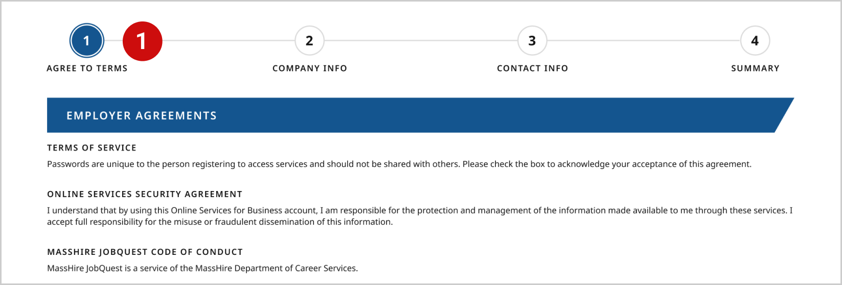
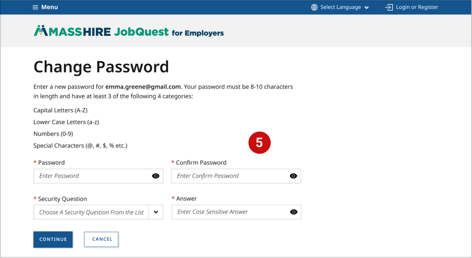
Designed step counter to give users more information about how long registration will take.

Provided users more information about what a FEIN number is and the resource to be able to locate it online. This eliminated a previously major block to registering.
Gave the option to divide user responsibility of posting jobs on the platform and fielding IT related issues to the appropriate department.

Provided a summarized view of the information users entered for error prevention before submission.

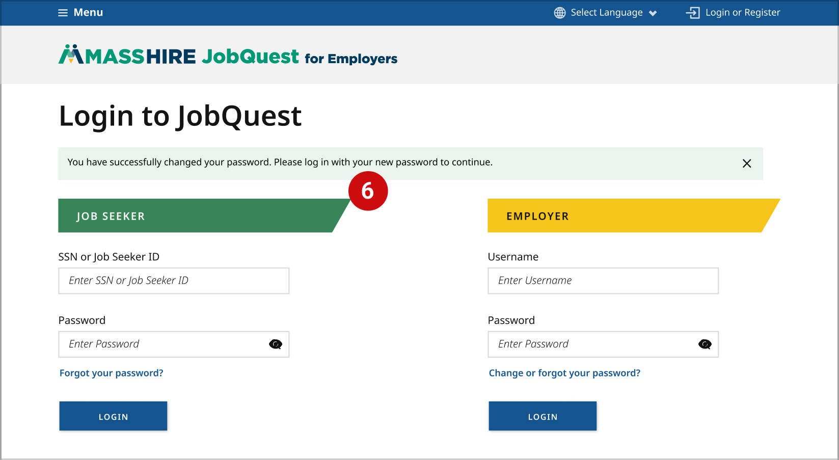
Served users a toast message upon successful registration with information on manual approval of their account.

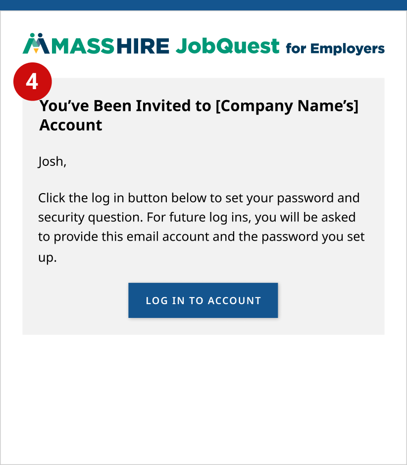
Created emails for users to receive confirmation of their requests, successful, or unsuccessful registration.


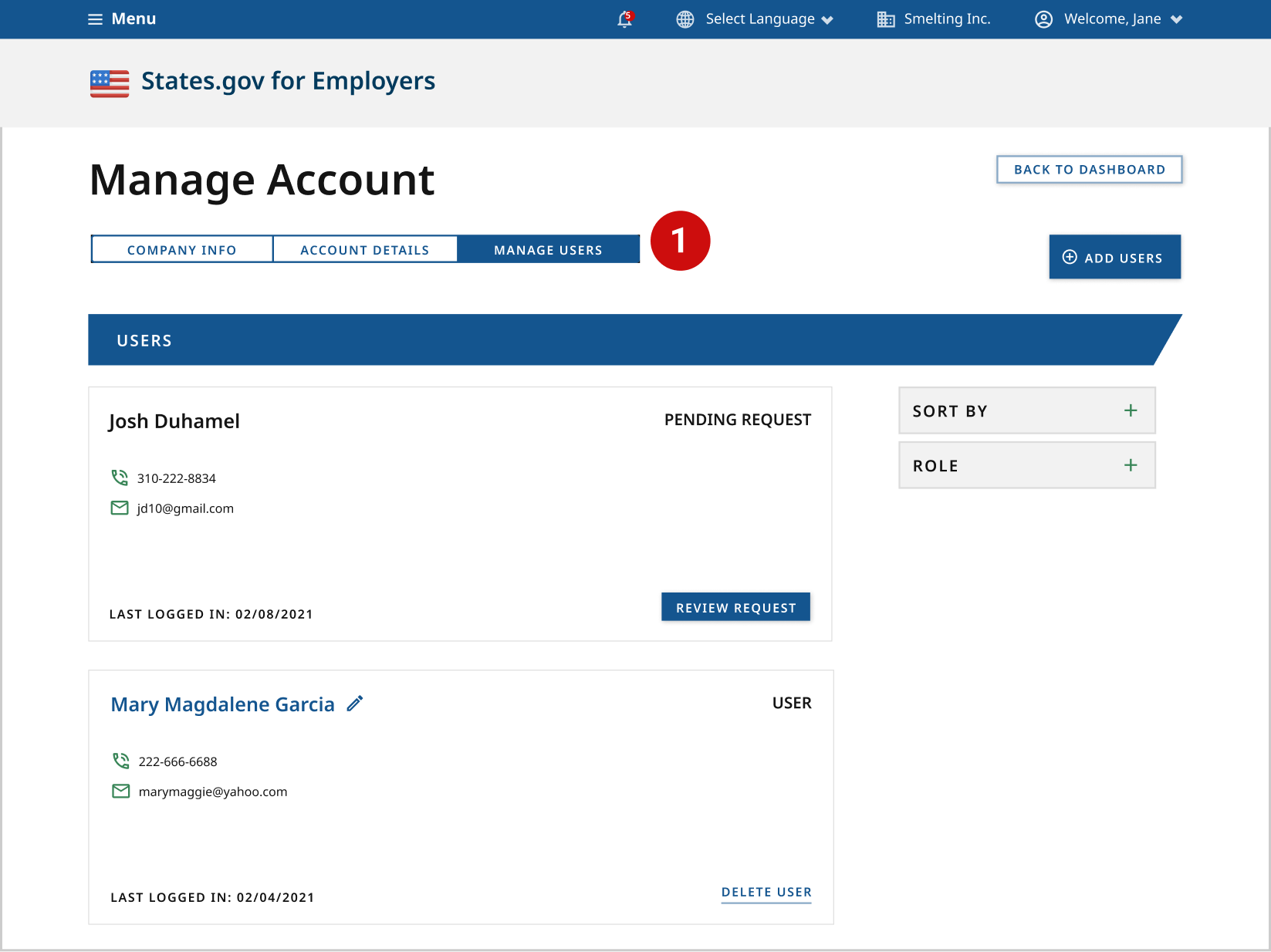
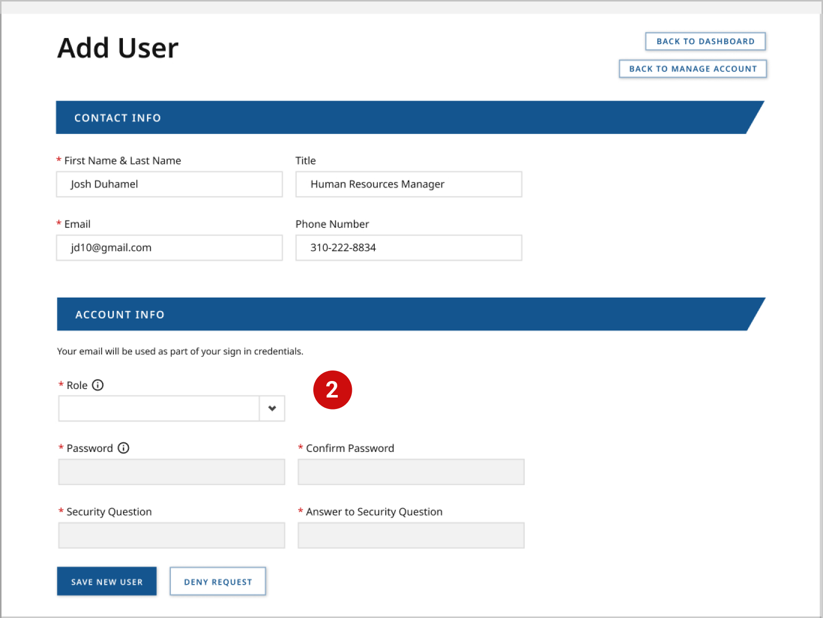
One of the largest pain points for companies using the job post platform was a lack of ability to have multiple users associated with an account. With this restriction in place, companies were at high risk of losing their account sign in information and secondly, it limited with how many people could help to manage job posting and candidate management. By collaborating with our stakeholder tech lead and lead developer, we were able to devise a system that allowed the following:

50% reduction in help / support desk calls for account registration and approval.
20% reduction in duplicate employers accounts within the platform’s system.
15% increase in site activity on the employer side.
Despite the step counter, users had no visibility as to where certain information would be entered. Moreover, job post information was not always relevantly categorized together into appropriate sections.
The job’s detail section was particularly challenging for any government positions to be posted on the website as many would go beyond the character limit. Often times these employers had to post as much as they could with no help to create any text hierarchy for their information.
Most users believed they were limited to the job category/ job functions lists that were provided on this page within the menu. Many users as a result were unable to find an appropriate job title for their post.


While analyzing the job post flow uncovered some pain points, we decided to conduct additional interviews with one of the directors for the program as well as a local, small employer. We received the following feedback:
“Most people don’t even know they can have a career center representative help them post jobs.”
“It’s been difficult in the past to help employers find positions that require more specialized training or involve an advanced degree since we don’t have an input section for that.”
“Sometimes companies need to hire multiple people for the same job. There’s not really a section that’s dedicated to communicating that.”
“Very hard to see referrals from career centers.”
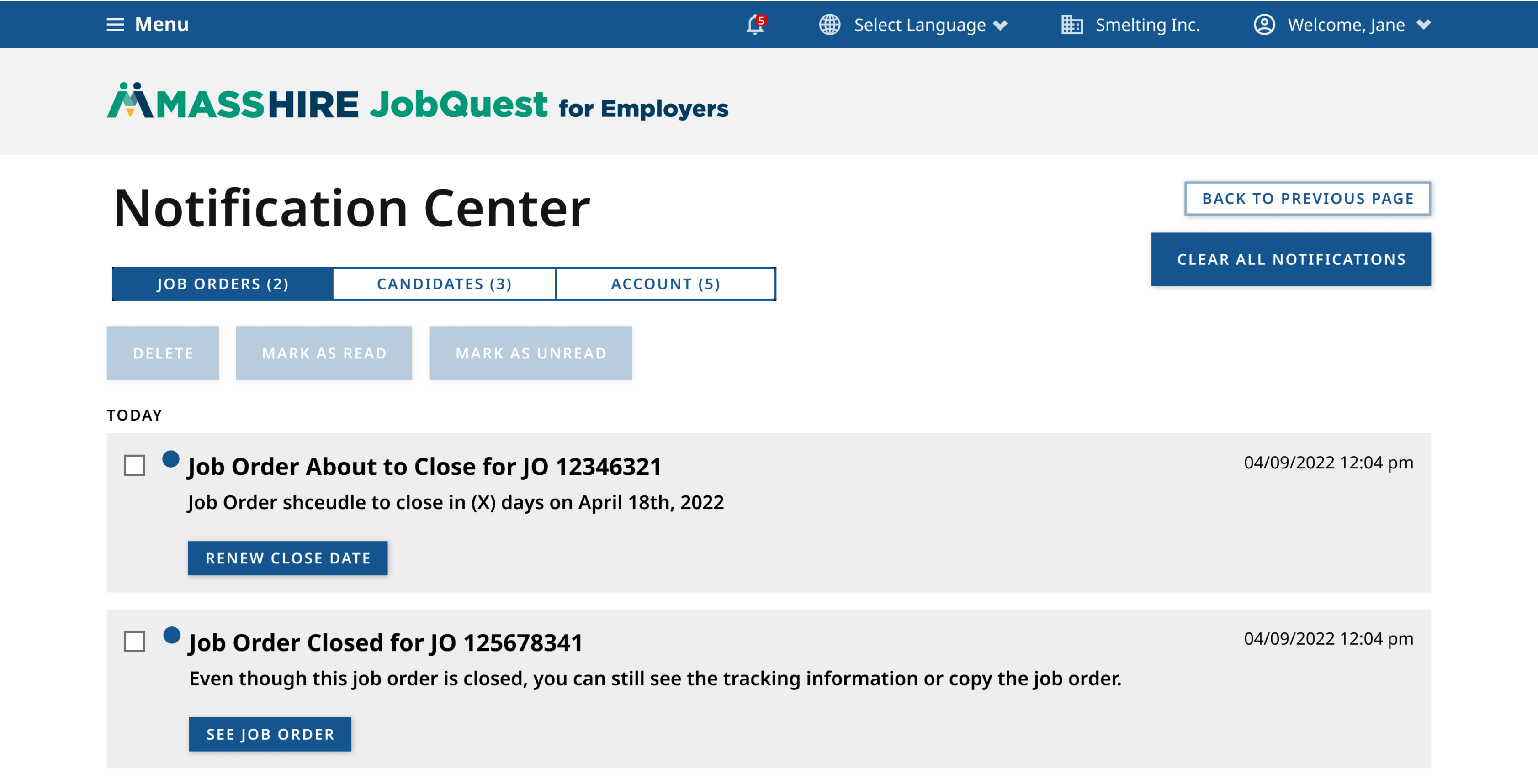
“We’re not alerted when job posts close. We’ve had times where multiple weeks go by only to realize that our job post has expired.”
“In some cases we’ve found a candidate but are unable to close the job posting due to the platform's fixed 90 day live post rule. We wish we could just close down the posting when the position has been filled to avoid extra candidate calls.”
“Sometimes we have multiple job openings available and it’s cumbersome to post them since we can only do one at a time.


We knew based on our discussion with stakeholders and additional contextual inquiries that the job posting experience felt very disconnected. One of the key differences we brought to our new solution was creating a centralized view of all jobs posts for an employer and creating a strong connection between candidates for the job and the posts themselves.
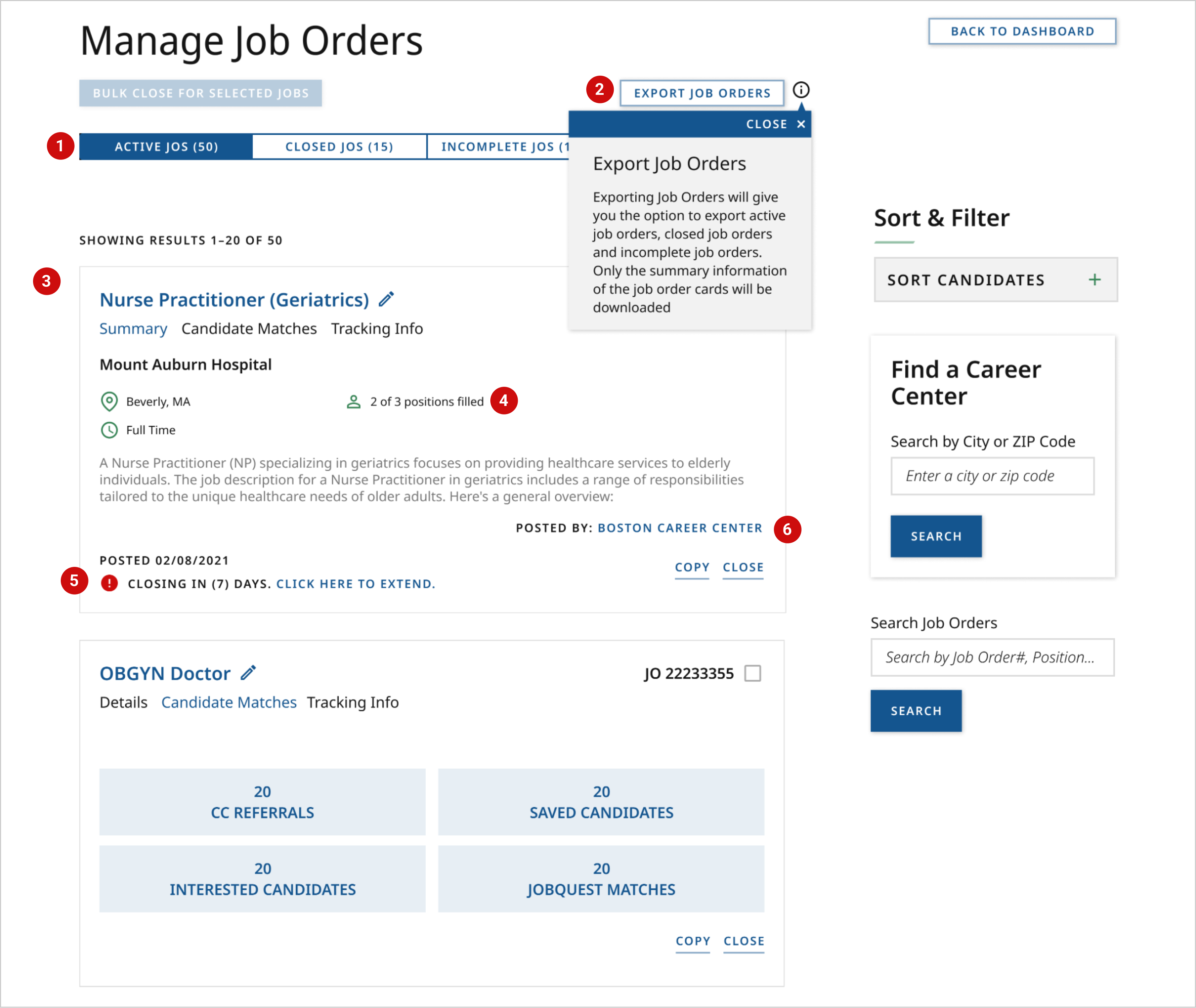
Actions that influence the status of a job posting are also echoed in a notification center that is placed within a user’s global nav.
Throughout the documentation process, we understood that several pain points existed in the disconnected nature between job posts and job candidates which included the following:
We approached these problems with the question: what if candidate management and job management were merely two sides of the same coin?
Educate users on the ability to refine their search using SQL commands such as ‘or’, ‘and’, use of quotations marks and understanding classifications of job category and title according to the state.
Helpful with state positions that would like to hire veterans.
Ability to look for someone with advanced degrees such as Bachelors, Masters, PhD, MD etc.
Give employers the ability to find candidates again that they forgot to save using their Job Seeker ID (unique identifier)
Users were previously restricted to regions or states which could produce candidates that were technically in the area of but still far away. We added more exact location features to find truly local candidates.

Not everyone's mental models are the same. To reflect this, we wanted to make it as easy as possible for employers to save candidates and gate the two ways to either invite a candidate to apply via their summary card or through their resume display page.
Once candidates are saved in connection with a job post, employers can easily track all of their candidates through their dashboard.
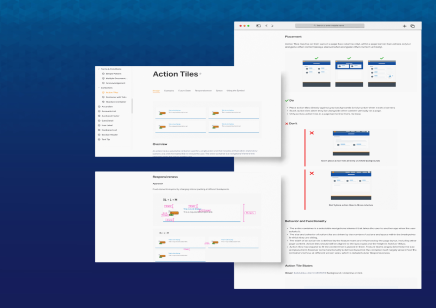
UX design doesn’t always have to be cutting edge to deliver deeper, impactful results. It was a great challenge to work within the original framework of the state government’s site infrastructure and a very satisfying accomplishment to still make great improvements.